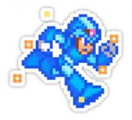
I've seen some come out much worse, but yeah the default one doesn't do your art justice. (http://www.screensho...omparison/96350)
Congrats on 2nd place by the way!
The problem with how the loading screens are added to the game is threefold. I'll try to give you a few tips on how to mitigate it, but your mileage may vary.
1. The art is scaled down to 640x480
Avoid adding fine details, they'll be lost or hard to make out when scaled. A single pixel line or dot will likely just become a smudge.
Diagonal lines may become jagged when scaled up again by the game client.
2. They're heavily compressed with JPEG to fit within 100KB
This is probably the biggest culprit, and harder to work around. Some compression artifacts are unavoidable as far as I know. And again, fine details will be wiped out.
JPEG really hates gradients. Try to use solid colors when you can, which also helps with the 3rd problem.
Also, be sure to save your art using PNG, which is pixel-perfect, as saving in JPEG will make it go through the compression artifact-inducing process twice. (I see that you do, but just a note for others.)
3. The color bit depth of the game is effectively 15bit
This means the game uses 5 bits per channel, as opposed to Photoshop's default 8 bits/channel.
Simply said, the game just doesn't have a big enough color palette to color the art the way we paint it.
Gradients will become bands of color (See the Don't Buy Zeny screen above), and similar colors next to each other may be displayed as one.
Again, minimize gradients (which also includes blurs and drop shadows), and try to use contrasting colors to separate edges when you can.
One way to check to see if the colors will look right in-game is to try viewing it in "Indexed Color" mode, which brings it down to 256 colors/8bit, which is 3 bits per channel. Scrunch3y submitted his this way.
He used dithering though, so the result wasn't perfect.
Dithering would be good– I use dithering in these HiRes loading screen packs to avoid the gradient banding. The problem with using dithering on a submission is problem #1 though- the images are scaled to 640x480, which turns all of the 1 pixel dithering marks into smudges.
If you do submit an indexed color-ed artwork, include a link to the original RGB color one too please! I have extra tricks I can use for making these HiRes ones look good.
I hope this helps.
Edited by gamnark, 17 October 2014 - 05:27 PM.