


You can rate if you want!


I made it Off Topic
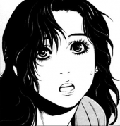
Posted 27 December 2010 - 10:58 AM
Amateur Blogger
Posted 27 December 2010 - 11:49 AM
Amateur Blogger

Posted 27 December 2010 - 11:53 AM
Edited by SilverBlood, 27 December 2010 - 11:55 AM.
I made it Off Topic
Posted 27 December 2010 - 12:31 PM
I do, nice job Reggie. : )
Nice color-compo. Like the splatter and smudge effect. Only - would be that ur render is a little overscharpenend.
Also Try tekst placement on bottemleft of the char instead of the right. It's kinda breaking the natural flow.
2-3 px black border. Classic =). Always use that myself xD.
What version of PS u use =P ? ( DONT TELL ME YOU USE GIMP D: ). And how long u've been making signatures ?

 ) and added some blur + gradient map (15%)
Edited by Killerreggie, 27 December 2010 - 12:32 PM.
Amateur Blogger
Posted 27 December 2010 - 01:18 PM
Thank you too! Well I like the sharpen, it's not oversharpened imo.
I edited it some: moved text (you're right, flow was being broken
Black border ftw! hehe
I use PS CS4. Several years but only yesterday I began the "serious business" using tutorials and stuff.. It's fun!
Thanks for your tips, appreciate it! greets, reggie
P.S.: Your signature is preety awsm.
Awarded #1 Troll

Posted 27 December 2010 - 04:23 PM
Do you like it?
You can rate if you want!
Amateur Blogger

Posted 17 February 2012 - 05:09 PM


0 members, 0 guests, 0 anonymous users

