


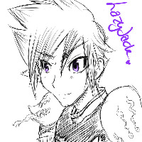
So here is my interpretation of how the sprites should look like, based on the official character design:


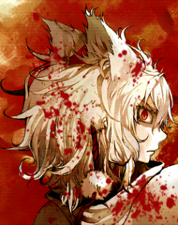
And I've actually tried animating the female rune knight:


Edited by Heho, 08 August 2011 - 02:34 AM.


I am New.

Posted 07 August 2011 - 11:12 PM
Edited by Heho, 08 August 2011 - 02:34 AM.
I made it Off Topic

Posted 08 August 2011 - 02:06 AM
I am New.
Posted 08 August 2011 - 02:39 AM
You don't like the Genetic's 'Munching Shoulder Pads'
Personally I like the Old RK Armor better, maybe have the stones glow when they are in active animation. and then change color to a dull gray when dead.

Too Legit To Quit
Posted 08 August 2011 - 07:13 PM
Awarded #1 Troll

Posted 31 August 2011 - 05:17 AM

Edited by Yomihime, 28 December 2011 - 01:21 AM.
I made it Off Topic

Posted 05 September 2011 - 03:02 PM


Edited by Seraphiel, 05 September 2011 - 03:06 PM.
Too Legit To Quit

Posted 08 September 2011 - 03:34 PM
I made it Off Topic
Posted 08 September 2011 - 04:56 PM
Royal Guards... the females... they have HUGE shoulders and tiny hips. So disproportional.
Loyal White Wolf
Posted 08 September 2011 - 05:47 PM

Too Legit To Quit
Posted 15 November 2011 - 09:57 AM
Do away with the sorcerer shoulder staps of dead bird feathers and you'll sell me
Too Legit To Quit

Posted 15 November 2011 - 11:44 AM
They're anything but chunky; just they have wide hips. (Which has been a Sage thing since the beginning.)Sorcerers are chunkyy.

Too Legit To Quit
Posted 15 November 2011 - 09:42 PM
They're anything but chunky; just they have wide hips. (Which has been a Sage thing since the beginning.)
Awarded #1 Troll
Posted 22 November 2011 - 12:37 PM
Too Legit To Quit

Posted 22 November 2011 - 01:23 PM
Amateur Blogger

Posted 13 December 2011 - 11:14 PM
Hey guys just wondering if anybody out there also thinks that the HQ should redraw the 3rd job class sprites since they are so "not attractive". I mean even the transcendent classes look better than them! Could any moderators here actually propose to the HQ for a re-sprite? XD
So here is my interpretation of how the sprites should look like, based on the official character design:
And I've actually tried animating the female rune knight:
I made it Off Topic
Posted 14 December 2011 - 12:43 AM
Amateur Blogger

Posted 14 December 2011 - 12:44 AM
I made it Off Topic
Posted 14 December 2011 - 01:03 AM
Amateur Blogger
Posted 14 December 2011 - 01:23 AM
 the headgears only look proper with the old style hair styles...like the first 4 when ro first came out. seems alot of headgears arent affected by them.
Too Legit To Quit
Posted 14 December 2011 - 03:48 AM
Royal Guard should've had a cape, and not a shield on it's back. Why break with tradition?
Guillotine Cross could've done with some sort of cloak. They're not very stealthy looking as is.
Male Archbishop looks cheap. It looks like a rushed design with less work put into the concept. There's significantly less detail on his clothes than any of the previous priest classes.
Male Ranger's chest looks weird. The clothing doesn't sit right.
Genetic's man-eating shoulderpads are stupid. 'nuff said. Where's the lab coat?
Awarded #1 Troll
Posted 28 December 2011 - 01:24 AM
But, but, their predecessors aren't used to be like thatbut they are merchant class.
Sorry they are used to it.


0 members, 0 guests, 0 anonymous users

