I think the pictures look a bit blurry. Either that or my eyes are melting. I think there's a way of getting uber graphics with a plug-in or something. I don't know more than that  .
.
Yeah i would be glad if i could get better quality, cause i did only take the last picture myself, the others are taken by the once that got the siggys cause i asked them for pictures.

Would be glad if you could help me looking for the plug-in x)
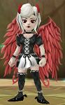
Looks good could use small amount of work of vullt's tho. the blade got clipped and the speed buff messes with the tag, next time they want one make sure they dont have that dust cloud
IKR! i told him to take a screenshot without any buffs at all, but he was to lazy so i made a 15 min siggy but the minutes was spent on figuring out how to make it look good with the clouds, this time i blame the owner for the quality, that was the best pic out of 6 diffrent once

, but i guess i was happy with it after all cloud work cause if i took of the cloud fully, his legs would look weird

to try and avoid outlining. Not sure if it is something you did on purpose or the type of filter you used, it just takes away from the natural look that I like to see from your type of signature. If you are trying to make different sections of the signature stand out more than others, try a drop shadow instead of an outline, maybe even a wider spread, distance or blur to the drop shadow as well.
in the first signature you hae, the names in the background appear to mess up the screen... not sure if it still works or not, but in the past, typing "/noui" in the chat box removed the interface, making for perfect screenshots with no clutter... and then to get the interface back, you had to type "/noui" again. Just a suggestion there of course.
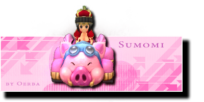
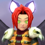
The piggy one to me looks the best, however it also appears to have an outline to it, though it doesn't seem to take away from anything.
Your editing of the fonts is pretty darn good though. At least I should ask if you edited or created those fonts. They appear to just be edited, but I don't ant to assume. Either way, they look very good.
Keep up the good work!
Please keep in mind that I am not a professional artist, nor have I gone to school for artistry... this is just my personal opinion.
Gonna answer to all your things here xD so i didn't cut that much in your text lol!, really good reply thank you for that!.
Okay at first, i LOVE outlining, cause its something i have been doing forever, its like my way of having a signature if you get what i mean?.
I want it not to look like the actual game characters, i would rather like them to look like stickers, before i did a thick white outlining then a black outlining on the thick white one and i usualy did put a pin on it, but i got tired of that and got used to the black outlining.
But the most recent picture is the pig one, cause that one was made like last week so i have taken down on the outlining but i still like it, it kinda defines my style (:
I know about /noui, it's just that my boyfriend (teddyonspeed), is silly, note this: REALLY silly.
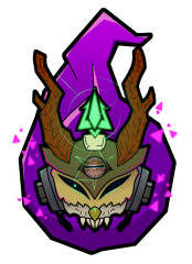
Actually, the planned signature for him wasn't supposed to look that way, but then... he met Calanor.
And he almost jumped over me "MAKE A SIGNATURE WITH CALANOR ON IT!!!!".
So I did, that's why i didn't put on /noui cause then calanors name wouldn't appear.
I tried with getting rid of the background names, but that really looked fake.
I am still thinking what i can do about his signature to not make it look like there's to many names.
Im going to come up with this later on, any suggestions pherhaps? (:
And about the cute fonts ^_^The "everybodykillaz" font isn't fully made by me used a base font dont remember its name but now its called "japan" and its out on dafont, but mine is with outliner (: cause i like everything to match.
The vultt one and teddyonspeeds font is made by someone i know on order by me, like designed and so on, but since my computer doesn't want to save my fonts, i usualy let other people do them for me after i draw them.
I have had problems with saving things in PNG., (what a disaster!), so it takes some time to make my computer understand that it's supposed to be TRANSPARENT

But if you want to make your own fonts, a tip is; Use a font thats casual, like Georgia, Arial or something in that style.
And then you draw it like you want to and add stuff.
Cause arial and those font's are good bases, and it will still be yours cause it won't look like the original font at all, except if you want to give credits to your base of course, but i bet you won't do a font that looks exactly like georgia or something

With regards to TruPain's comment on the outline, its both correct and false? I use outlines on my characters, however i apply it in the mannor of
"outline > feather > drop inner shadow", It defines the edge, but doesn't give a thick line, so it'll keep that natural flow
I'm trying to! I made a success with the piggy didn't I? haha! ^_^
So i was wondering something...Do you guys think my signatures got to little things of them / looks boring because they are simple
@__@ Thank you so much for the responses im quite shocked that you did put down all that time on feedback ^_^
Edited by DigitalKitten, 10 November 2011 - 05:16 AM.