


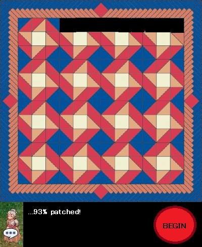
That patch skin design is lovely. I love the roundness of the interface and how poppy and cheerful everything looks. It would be really nice if the mini announcement banners didn't look like this all the time though. :/
Still, amazing design. I'd really like to see that as the patcher. =D

Ragnarok Patch Client Layout + Skin Contest
Started by
Resplendent
, Mar 13 2012 12:16 PM
157 replies to this topic
#26

Rosenthrall
-

- Members
- 288 posts
Amateur Blogger
- LocationAlberta, Canada
- Playing:Ragnarok Online
- Server:Valkyrie
Posted 03 April 2012 - 03:12 PM
#27
Oda
-

- Community Managers
-

- 10261 posts
Overseas
- Twitter:@Oda_CM
- LocationAmatsu
- Playing:Ragnarok Online
Posted 03 April 2012 - 03:16 PM
Are they that bad...?That patch skin design is lovely. I love the roundness of the interface and how poppy and cheerful everything looks. It would be really nice if the mini announcement banners didn't look like this all the time though. :/
Still, amazing design. I'd really like to see that as the patcher. =D
#28
Charisma
-

- Members
- 421 posts
Amateur Blogger
- Playing:Ragnarok Online
- Server:Ymir
Posted 03 April 2012 - 03:21 PM
Are they that bad...?
They're not bad if you're nostalgic for the mid 90s

#29
Rosenthrall
-
- Members
- 288 posts
Amateur Blogger
- LocationAlberta, Canada
- Playing:Ragnarok Online
- Server:Valkyrie
Posted 03 April 2012 - 03:29 PM
Are they that bad...?
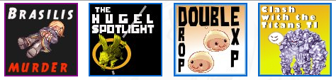
Imo, they are really badly put together. The concepts for the double drops/EXP banner is cute and the Hugel spotlight one is really clever. I laughed out loud at that one. But the fonts and the colours are just really... not suitable? The double drops/EXP font actually reminds me of Spongebob Squarepants.
#30
Oda
-
- Community Managers
-
- 10261 posts
Overseas
- Twitter:@Oda_CM
- LocationAmatsu
- Playing:Ragnarok Online
Posted 03 April 2012 - 03:37 PM
That's what you get when you have an architecture grad doing graphic design work...
#31
Kitten
-

- Members
- 3077 posts
Too Legit To Quit
- Playing:Ragnarok Online
Posted 03 April 2012 - 03:45 PM
They're pretty bad.
#32
Oda
-
- Community Managers
-
- 10261 posts
Overseas
- Twitter:@Oda_CM
- LocationAmatsu
- Playing:Ragnarok Online
Posted 03 April 2012 - 04:18 PM
Any good sources of small image design? I'd like to steal learn from good sources, but there aren't a lot of banner images around the scale we put in weekly. Since we'd have to request images weeks in advance from our in-house design team it's pretty much been just me making these up.
#33
Rutana
-

- RO Fungineering
- 1553 posts
Too Legit To Quit
- LocationGermany
- Playing:Ragnarok Online
- Server:Ymir
Posted 03 April 2012 - 04:23 PM
*hint*
when you have to work with small sizes, why not making sprite edits?
when you have to work with small sizes, why not making sprite edits?
#34
Rosenthrall
-
- Members
- 288 posts
Amateur Blogger
- LocationAlberta, Canada
- Playing:Ragnarok Online
- Server:Valkyrie
Posted 03 April 2012 - 04:26 PM
If you wouldn't mind an outside source making them, I would like to volunteer to make them.  I've made a lot of work around that size.
I've made a lot of work around that size.
#35
Oda
-
- Community Managers
-
- 10261 posts
Overseas
- Twitter:@Oda_CM
- LocationAmatsu
- Playing:Ragnarok Online
Posted 03 April 2012 - 04:31 PM
Well, just made this one right now (I will try to learn):

The main reason I'm doing these right now, is that promotions will come up pretty quickly that need banners that can be put together before maint. Probably wouldn't be a bad idea to get some help in designing ones for events we have in the pipeline though.
The main reason I'm doing these right now, is that promotions will come up pretty quickly that need banners that can be put together before maint. Probably wouldn't be a bad idea to get some help in designing ones for events we have in the pipeline though.
#36
Chorvaqueen
-

- Members
- 1098 posts
Too Legit To Quit
- LocationMiddle Earth
- Playing:Ragnarok Online
- Server:Teyvat
Posted 03 April 2012 - 06:11 PM
Maybe you should give a general list of stuff that will surely need banners.Well, just made this one right now (I will try to learn):
The main reason I'm doing these right now, is that promotions will come up pretty quickly that need banners that can be put together before maint. Probably wouldn't be a bad idea to get some help in designing ones for events we have in the pipeline though.
•EXP mod banner/icon
•Lucky Box/KP promo or something like that template (something like you can just change the sprite icon on it)
•TI template that shows gramps (just replace current monster/theme every week)
Spoiler
#37
Rutana
-
- RO Fungineering
- 1553 posts
Too Legit To Quit
- LocationGermany
- Playing:Ragnarok Online
- Server:Ymir
Posted 03 April 2012 - 06:14 PM
Btw, you should consider to change the start post, since this isn't about the original patcher alone anymore and the rules therefor don't apply, so people who only read the first post may be confused.
Even I don't know if I should just post an finnished image or how I should submit my patcher-version I'm working on right now, since there's no clear answer to it :/
Even I don't know if I should just post an finnished image or how I should submit my patcher-version I'm working on right now, since there's no clear answer to it :/
#38
Resplendent
-
- Members
- 543 posts
Grand Nagus
- LocationWashington State
- Playing:Ragnarok Online
- Server:Sakray
Posted 03 April 2012 - 06:22 PM
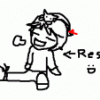
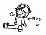
Building on Bara's (hope you don't mind) it'd be nice to view patch notes directly in the patcher, so I figured the large banner could turn into the notes, and have the bar on the right side be the lists of notes.


My Photoshop skills are pretty bad, so it's not as neat as the original.
My Photoshop skills are pretty bad, so it's not as neat as the original.
Edited by Resplendent, 03 April 2012 - 06:28 PM.
#39
NeoNilox
-

- Members
- 797 posts
Awarded #1 Troll
- LocationSantiago, Chile
- Playing:Nothing
- Server:What server?
Posted 03 April 2012 - 07:19 PM
In my opinion, this shouldn't be called "Patch Skin Contest" but something like "New Patch Client Layout Contest" or such. Because for Patch Client Skin, this is what I see.
Bara-chan's Patch Client Layout is amayzing, hands down.
Bara-chan's Patch Client Layout is amayzing, hands down.
Edited by NeoNilox, 03 April 2012 - 07:20 PM.
#40
Rosenthrall
-
- Members
- 288 posts
Amateur Blogger
- LocationAlberta, Canada
- Playing:Ragnarok Online
- Server:Valkyrie
Posted 03 April 2012 - 07:56 PM
Well, just made this one right now (I will try to learn):
The main reason I'm doing these right now, is that promotions will come up pretty quickly that need banners that can be put together before maint. Probably wouldn't be a bad idea to get some help in designing ones for events we have in the pipeline though.
I think it's a good idea and would probably help with the (pre?) maint workload, perhaps. I do Photoshop for fun mostly. I don't even know if this is relevant anymore, but I played around and came up with this:

It's my first time ever working with sprites in general though. xD
Edited by Rosenthrall, 03 April 2012 - 08:35 PM.
#41
barachan
-

- Members
- 68 posts
I made it Off Topic
- LocationATL, USA
- Playing:Ragnarok Online
- Server:Ymir
Posted 03 April 2012 - 08:24 PM
aww thanks you guys!
in response to modifying my layout (well, oda's originally!) i don't mind at all, i was actually going to say with my first post that it's fine by me if anyone wants to use my files to create their own skin, but then i wasn't sure if mine is even code-able yet so i didn't want to possibly waste anyone's time. but if you still want to, go for it!
resp - i really like the idea of having the full patch notes load in the patcher!! much more convenient that way. i think the dark buttons on the side might make the whole design a little too dark/unbalanced though, so here's some more mockups running with that idea:

instead of buttons, maybe just text links with a small text preview under each date
or

since the patch notes are usually short sentences anyway, they still fit okay on the side, so perhaps we can have them displayed fully over there, or...would it be possible to have the dates coded with a little CSS/JS so that when you click one, its corresponding notes unfold/collapse under it?
additionally i took out my doofy poring and added social icons
i can also come up with those little banner images pretty fast, so...if you guys ever need some just hit me up
.....i guess i should actually log on to MSN more than once a year huh
oda - i don't know anything about architecture, but...i assume you may have already been taught about the golden ratio/rectangle, rule of thirds, etc? you seem to have a good grasp of proportion already and most of the type in your banners is easy to read, which is really more important than girly colors or any other pretty details...(what good is an ad if you can't read it at a glance?)
but if you're interested and have the time, i'd recommend poking around here a bit: http://www.thegridsystem.org/
also: http://www.alistapar...web-typography/
and if you want links to good font sites i can HOOK YOU UP MANG.
in response to modifying my layout (well, oda's originally!) i don't mind at all, i was actually going to say with my first post that it's fine by me if anyone wants to use my files to create their own skin, but then i wasn't sure if mine is even code-able yet so i didn't want to possibly waste anyone's time. but if you still want to, go for it!
resp - i really like the idea of having the full patch notes load in the patcher!! much more convenient that way. i think the dark buttons on the side might make the whole design a little too dark/unbalanced though, so here's some more mockups running with that idea:
instead of buttons, maybe just text links with a small text preview under each date
or
since the patch notes are usually short sentences anyway, they still fit okay on the side, so perhaps we can have them displayed fully over there, or...would it be possible to have the dates coded with a little CSS/JS so that when you click one, its corresponding notes unfold/collapse under it?
additionally i took out my doofy poring and added social icons
i can also come up with those little banner images pretty fast, so...if you guys ever need some just hit me up
.....i guess i should actually log on to MSN more than once a year huh
oda - i don't know anything about architecture, but...i assume you may have already been taught about the golden ratio/rectangle, rule of thirds, etc? you seem to have a good grasp of proportion already and most of the type in your banners is easy to read, which is really more important than girly colors or any other pretty details...(what good is an ad if you can't read it at a glance?)
but if you're interested and have the time, i'd recommend poking around here a bit: http://www.thegridsystem.org/
also: http://www.alistapar...web-typography/
and if you want links to good font sites i can HOOK YOU UP MANG.
#42
Resplendent
-
- Members
- 543 posts
Grand Nagus
- LocationWashington State
- Playing:Ragnarok Online
- Server:Sakray
Posted 03 April 2012 - 09:28 PM
I like the collapsible dropdown idea. My only other suggestion would be to make the "Patch Notes" text a little easier to read. Since presumably that whole sidebar would be an HTML page like the one the current patcher uses, I'm sure JS/CSS would be totally doable.
Edited by Resplendent, 03 April 2012 - 09:40 PM.
#43
Sera
-
- Members
- 4831 posts
Too Legit To Quit
- Locationthis evil world
- Playing:Ragnarok Online
- Server:iRO Chaos
Posted 04 April 2012 - 05:45 AM
I found the little square things amusing enough, if mismatched.
The client I designed was specifically to focus on the patching aspect of the process.
The client I designed was specifically to focus on the patching aspect of the process.
#44
Oda
-
- Community Managers
-
- 10261 posts
Overseas
- Twitter:@Oda_CM
- LocationAmatsu
- Playing:Ragnarok Online
Posted 04 April 2012 - 07:34 AM
^^ I see what you have did there ^^
I appreciate the links! Also I should probably note that my strong suit was architecture history, not design...so if you guys need to know about the influence of Wiemar era-socialism on German housing architecture or cultural influences on art deco that's a little more my speed...
Currently I am using dafont for free fonts and checking out these guys http://losttype.com/ for more retro fonts.
I plan to be stealing much more of this sort of thing: http://minimalmovieposters.tumblr.com/ definitely looking for good design blogs/tumblrs of this sort.
oda - i don't know anything about architecture, but...i assume you may have already been taught about the golden ratio/rectangle, rule of thirds, etc? you seem to have a good grasp of proportion already and most of the type in your banners is easy to read, which is really more important than girly colors or any other pretty details...(what good is an ad if you can't read it at a glance?)
but if you're interested and have the time, i'd recommend poking around here a bit: http://www.thegridsystem.org/
also: http://www.alistapar...web-typography/
and if you want links to good font sites i can HOOK YOU UP MANG.
I appreciate the links! Also I should probably note that my strong suit was architecture history, not design...so if you guys need to know about the influence of Wiemar era-socialism on German housing architecture or cultural influences on art deco that's a little more my speed...
Currently I am using dafont for free fonts and checking out these guys http://losttype.com/ for more retro fonts.
I plan to be stealing much more of this sort of thing: http://minimalmovieposters.tumblr.com/ definitely looking for good design blogs/tumblrs of this sort.
#45
Rutana
-
- RO Fungineering
- 1553 posts
Too Legit To Quit
- LocationGermany
- Playing:Ragnarok Online
- Server:Ymir
Posted 04 April 2012 - 08:00 AM
Btw, you should consider to change the start post, since this isn't about the original patcher alone anymore and the rules therefor don't apply, so people who only read the first post may be confused.
Even I don't know if I should just post an finnished image or how I should submit my patcher-version I'm working on right now, since there's no clear answer to it :/
In my opinion, this shouldn't be called "Patch Skin Contest" but something like "New Patch Client Layout Contest" or such. Because for Patch Client Skin, this is what I see.
Bara-chan's Patch Client Layout is amayzing, hands down.
*cough cough*
#46
Oda
-
- Community Managers
-
- 10261 posts
Overseas
- Twitter:@Oda_CM
- LocationAmatsu
- Playing:Ragnarok Online
Posted 04 April 2012 - 10:19 AM
It's on the patcher now, looks great!I think it's a good idea and would probably help with the (pre?) maint workload, perhaps. I do Photoshop for fun mostly. I don't even know if this is relevant anymore, but I played around and came up with this:
It's my first time ever working with sprites in general though. xD
#47
Rosenthrall
-
- Members
- 288 posts
Amateur Blogger
- LocationAlberta, Canada
- Playing:Ragnarok Online
- Server:Valkyrie
Posted 04 April 2012 - 11:40 AM
Thanks, Oda! I definitely wasn't expecting that. o-o
That class sounds great. No joke. O_O
That Tumblr is really great! Definitely following. I'm kind of a design nerd though I'm still new to noticing good design, but these Tumblrs might be interesting.
Letterheady
Prettyclever
Typographie
Typeeverything
Typeworship
Visualsundae
Designdust
^^ I see what you have did there ^^
I appreciate the links! Also I should probably note that my strong suit was architecture history, not design...so if you guys need to know about the influence of Wiemar era-socialism on German housing architecture or cultural influences on art deco that's a little more my speed...
Currently I am using dafont for free fonts and checking out these guys http://losttype.com/ for more retro fonts.
I plan to be stealing much more of this sort of thing: http://minimalmovieposters.tumblr.com/ definitely looking for good design blogs/tumblrs of this sort.
That class sounds great. No joke. O_O
That Tumblr is really great! Definitely following. I'm kind of a design nerd though I'm still new to noticing good design, but these Tumblrs might be interesting.
Letterheady
Prettyclever
Typographie
Typeeverything
Typeworship
Visualsundae
Designdust
#49
Oda
-
- Community Managers
-
- 10261 posts
Overseas
- Twitter:@Oda_CM
- LocationAmatsu
- Playing:Ragnarok Online
Posted 04 April 2012 - 03:32 PM
A lot of this we could actually ask kRO to leave as html based, so it would be much easier for us to change out the main banner art, announcements. The one thing this could use is a "Replay" button next to the "play", as this feature will be coming very very soon.
#50
Rutana
-
- RO Fungineering
- 1553 posts
Too Legit To Quit
- LocationGermany
- Playing:Ragnarok Online
- Server:Ymir
Posted 04 April 2012 - 03:40 PM
A lot of this we could actually ask kRO to leave as html based, so it would be much easier for us to change out the main banner art, announcements. The one thing this could use is a "Replay" button next to the "play", as this feature will be coming very very soon.
Honestly, on from an artist perspective, could you PLEASE take at least a few minutes to write together everything needed for the patcher, everything you want, everything that has to be included and update the first post with it?
This is supposed to be a CONTEST for gods sake, give us rules to follow! Don't let this pass by in a way of "hey, sorry, but your entry can't be used since something's missing" for older entries because you weren't clear of that from the beginning...
In my case for example, I'm just done with the setting of the buttons and everything, it took me at least an hour to make it right - and while I'm working on the finnishing, I NOW get to know there's another button needed...?
I'm not the only one in that case, since we allready got 2 entries based on the patcher we have right now and bara-chans patcher, wich is outdated now btw..., was even edited by someone else, which surely isn't the premise of an contest anymore.
If you drop the contest idea and have this as a suggestion thread FROM THE START, let us know!
Have a bit more organisation within your contests please... this ruins the fun, especially after the last ones turned pretty bad as well.


0 user(s) are reading this topic
0 members, 0 guests, 0 anonymous users

